


Banner ads have been with us since the beginning of the internet. Here's how to design banner ads that convert.

Designing banner ads is one of the services I provide my clients for use in their online advertising campaigns. This type of digital creative has been around since the beginning of the commercial internet and you still see them everywhere - on websites you commonly visit, on apps you've downloaded to your smartphone, maybe even on your own website.
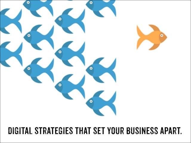
Banner ads play an important part in the digital advertising ecosystem today and are an effective way to inform an audience of anything noteworthy you want them to be aware of.
Banner ads come in 23 different sizes and dimensions so they can fit into various screen sizes ranging from large desktop PC monitors to tiny mobile devices like phones and tablets. There are also special sizes designed for posting to your social media accounts like Facebook, LinkedIn and Twitter.
As with all types of advertising creative, banner ads are designed to grab the attention of the viewer and compel them to take action. Clicking the ads redirects the viewer's browser to the advertiser's website, or frequently to a specific landing page that the merchant wants them to see.
Designing effective banner ads is both art and science, and here are some of my best design secrets with you. If you or your graphic designer want higher CTRs (click-through rates) for your own ads, you'll find the 10 tips below helpful:
Add your brand or logo. Boost your brand recognition by including your company's logo or URL web address.
Include an emotion-evoking image. Many companies use positive images showing the desired state of their customers; other expressions can include surprise, delight and happiness.
Use short, direct messaging. You have just a few seconds to grab your prospect's attention so keep your message short, ideally 10 words or less.
Make your text easy to read. Don't use exotic fonts that are hard to decipher, and try to stay away from fonts with serifs.
Don't try to be cute or clever in your text. Using humor or trendy terminology in your advertising falls flat more often than not. Stick with a "just the facts" approach.
Limit the use of colors in the text areas. No more than 2 or 3 colors, and try to minimize the use of red and green since 8% of the male population suffers from deuteranopia, or red-green color blindness.
Use a low-resistance call to action (CTA) on your button. More viewers will press a button labeled "Learn More" than one asking for a higher level of commitment, such as "Buy Now" or "Book An Appointment".
Don't use the button's color anywhere else in the ad. You want the button to be easily distinguishable from all the other elements in the banner.
Animate your ads slightly to register in the viewer's peripheral vision as they read the webpage. Too much or too rapid a movement is irritating to the viewer and they might mark it as spam. A simple animation - such as the button changing color at 4-second intervals - works well.
And finally, like everything else in digital advertising, use A/B split testing to measure and improve the CTRs of your ads. Gather enough impressions - at least 10,000 - to make comparisons statistically meaningful, and then replace under-performing banner ads with new ones to test against your top performers. Rinse and repeat.
Insider tip: I've found that the highest converting ads are review / testimonial ads. All other design elements being equal, these usually receive the highest CTRs of all ads.


Write A Comment