 Add Row
  Add
Add 


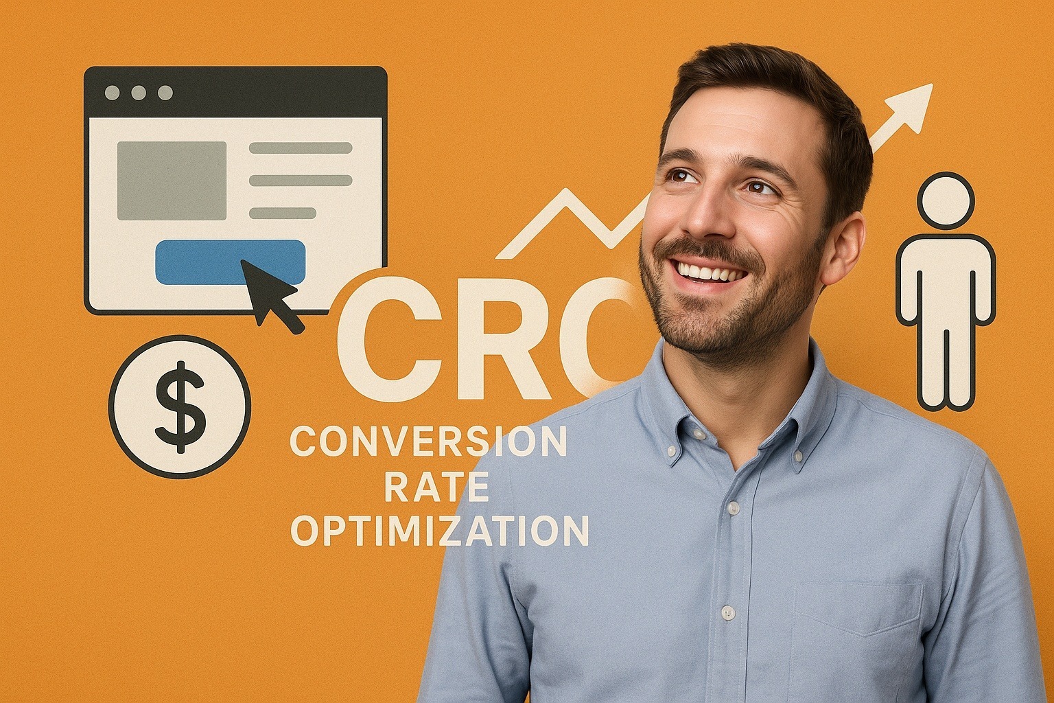
You don’t need a total website redesign to increase conversions. You need leverage, and conversion rate optimization (CRO) gives you that.
After years of split-testing pages, button colors, and calls-to-action, here are my favorite 10 lesser-known tactics that get your website visitors to take action (i.e., convert). I've organized them below by the three things that matter most: visitor psychology, user flow, and real-world usability.
🧠 Psychology & Persuasion
These tactics work because they quietly shift how your visitor feels about taking action.
1. Stack “Micro-Yes” Moments Before the CTA
Don’t jump straight to “Buy Now” or “Schedule a Call.” Lead with a series of little nudges — “Trusted by over 1,000 investors,” “No win, no fee,” “Cancel anytime.”
Each one reduces friction. Imagine yourself leading your prospect by the hand down a hallway, instead of shoving them through a door.
2. Negative Social Proof > Positive Social Proof
“Join thousands of happy customers” sounds nice and is still effective to a certain degree, but here's what works even better...
“7 out of 10 people have no written financial plan — and it shows when life throws them a curveball. Call me today."
"Over half of all homeowners don't know what their policies actually cover - until disaster hits."
People act faster to avoid pain than to chase gain. Use that to your advantage but don’t go full scare-tactic. Keep it real.
3. Reword CTAs to Match Intent
“Submit” is a dreadful word. “Learn More” is overused. Match the call-to-action text on your buttons and content to what your visitors actually want to do.
If they’re on your website's pricing page, try “Compare Plans.” On a demo page? “Show Me How It Works.”
When the button's text aligns with their own internal dialogue, it gets clicked.
4. Answer Objections Inline, Not Later
A standalone FAQ page doesn’t cut it anymore. If you’re asking for a credit card, put a short Q&A right next to the form.
“Why are we asking for this now? So we can set up your account instantly. You can cancel anytime.”
Meet and overcome objections exactly where - and when - they happen.
🎯 User Experience (UX) and Design Tweaks
These tweaks aren’t about making your website or content prettier. They’re about reducing visitor decision fatigue and guiding their action.
5. Scroll-Triggered Sticky CTAs
Don’t hit people with a call-to-action the moment the page loads, especially a pop-up form asking them for information. They’re not ready yet.
But once they’ve scrolled down a bit and had a chance to digest some of your content? That’s the perfect moment to slide in a sticky CTA. Mid-scroll is a good starting point, so start capturing them there.
6. Use Visual Anchors That Guide the Eye
Use arrows, lines, and images of people looking toward your button or opt-in form — these all subtly steer attention.
You don’t notice it, but your brain follows it. Good design isn’t just about looking nice. It’s about aiming eyeballs.
7. Use Progress Indicators in Multi-Step Processes
Filling out a form with multiple steps is work. But when you reframe it like this...
Step 1: Tell us your goal
Step 2: Get your personalized options
Step 3: Choose your best path
…now it feels like a personally-guided experience.
You’ve turned a task into a journey. Conversion rates rise accordingly.
8. Use “Warmup Zones” for Cold Traffic
I see this mistake made all the time - talking way too soon about features or benefits. Instead, start with a sentence, a stat, or a short video that speaks to the why in their minds.
You’re not selling yet — you’re tuning the visitor’s mindset. Let them settle in a bit. Then make your pitch.
⚙️ Technical and Analytical Tweaks
These are small moves that generate big results, especially when you’re already taking care of the basics. 95% of your competitors won't follow through on implementing these.
9. Find the Form Fields That Kill Conversions
Everyone knows shorter forms get filled out more often than longer forms, so striking the right balance is important. Yet, don’t just shorten forms randomly. Use a form analytics tool to track where people are bailing out.
If 57% of your website visitors drop off at “Phone Number,” consider making it optional — or explain why you're asking for it.
This easy optimization fix is usually just one field away.
10. Speed-Test on Devices Real People Use
Most marketers test website speed on the latest iPhone and gigabit internet. But your prospect might be using a five-year-old Android phone and Starbucks Wi-Fi.
Run your site through Google’s Mobile-Friendly Test and a real-world emulator. You’ll uncover UX friction you’d otherwise never see.
Final Thoughts On CRO
Contrary to conventional wisdom, conversion rate optimization isn’t about squeezing more blood from the same stone. It’s about removing friction, aligning intent, and making every click feel like the next logical step in the buyer's journey.
Many businesses don’t need more traffic — they just need to stop wasting the traffic they're already getting.
Next step: Pick two or three of these tips and have your webmaster test them this month. They’re small enough to implement quickly, but meaningful enough to drive real revenue shifts.
And isn't driving revenue what your website is ultimately all about?
If you’ve got a high-traffic site but conversions feel stuck, reach out to me.

Write A Comment